03. Overplotting, Transparency, and Jitter
L4 031 Overplotting Transparency And Jitter 1 V4
Data Vis L4 C03 V1
Overplotting, Transparency, and Jitter
If we have a very large number of points to plot or our numeric variables are discrete-valued, then it is possible that using a scatterplot straightforwardly will not be informative. The visualization will suffer from overplotting, where the high amount of overlap in points makes it difficult to see the actual relationship between the plotted variables.
Let's see an example below for each Jitter to move the position of each point slightly from its true value. Jitter is not a direct option in matplotlib's scatter() function, but is a built-in option with seaborn's regplot() function. The x- and y- jitter can be added independently, and won't affect the fit of any regression function, if made.
Example 1. Jitter - Randomly add/subtract a small value to each data point
# TO DO: Necessary import

# Read the CSV file
fuel_econ = pd.read_csv('fuel_econ.csv')
fuel_econ.head(10)

##########################################
# Resize figure to accommodate two plots
plt.figure(figsize = [20, 5])

# PLOT ON LEFT - SIMPLE SCATTER
plt.subplot(1, 2, 1)
sb.regplot(data = fuel_econ, x = 'year', y = 'comb', truncate=False);

##########################################
# PLOT ON RIGHT - SCATTER PLOT WITH JITTER
plt.subplot(1, 2, 2)

# In the sb.regplot() function below, the `truncate` argument accepts a boolean.
# If truncate=True, the regression line is bounded by the data limits.
# Else if truncate=False, it extends to the x axis limits.
# The x_jitter will make each x value will be adjusted randomly by +/-0.3
sb.regplot(data = fuel_econ, x = 'year', y = 'comb', truncate=False, x_jitter=0.3);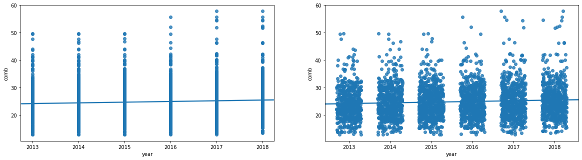
The scatter plot on left showing a simple scatter plot, while the right one presents with jitter.
In the left scatter plot above, the degree of variability in the data and strength of relationship are fairly unclear. In cases like this, we may want to employ transparency and jitter to make the scatterplot more informative. The right scatter plot has a jitter introduced to the data points.
You can add transparency to either scatter() or regplot() by adding the "alpha" parameter set to a value between 0 (fully transparent, not visible) and 1 (fully opaque). See the example below.
Example 2. Plot with both Jitter and Transparency
# The scatter_kws helps specifying the opaqueness of the data points.
# The alpha take a value between [0-1], where 0 represents transparent, and 1 is opaque.
sb.regplot(data = fuel_econ, x = 'year', y = 'comb', truncate=False, x_jitter=0.3, scatter_kws={'alpha':1/20});

# Alternative way to plot with the transparency.
# The scatter() function below does NOT have any argument to specify the Jitter
plt.scatter(data = fuel_econ, x = 'year', y = 'comb', alpha=1/20);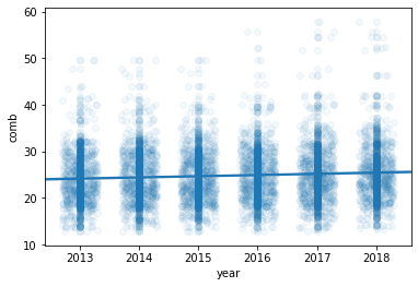
Plot all points with Jitter, and transparency.
In the plot above, the jitter settings will cause each point to be plotted in a uniform ±0.3 range of their true values. Note that transparency has been changed to be a dictionary assigned to the "scatter_kws" parameter.